21469 Views
Mobility
7 tips for preparing your Christmas road trip
7 essential tips for enjoying your road trip during these Christmas holidays
They are so recognizable that they do not need words to describe them. That is why they are the logos of the most famous car brands on the market. Some have gone through major changes from their origins to the present, but others have hardly changed their design since they were created.
Renault, Citroën, Ferrari, and Rolls-Royce are four very different brands, but they all have good stories behind their logos. Let’s get to know them.

If we take a look at the trajectory of this brand, it could well seem that this automobile company took a long time to decide on a logo for its vehicles, because its brand image is one of the ones that has had the most changes throughout its history. Founded in 1898 by brothers Louis, Marcel and Ferdinand Renault in France, the company’s first logo was two Rs framed in a medallion: the idea was to honor their surname.
When, in 1906, a Renault AK won the first French Grand Prix, the founders decided to change the company logo and honor the winning vehicle. And the car was there until 1919, the date on which the logo changed its design again.
During World War I, the French company began manufacturing tanks for the war. One of them, the Renault FT17, was a sales success as it was very manageable and fast due to its small size. And, of course, given that pride in their Renault AK led them to include it in their logo, it was obvious that they were going to do the same with their FT17. For this reason, at the end of the war, Renault had a tank on its logo.
After the war, the French company returned to its regular business, which was cars. From 1925, the design of their vehicles changed, and they placed the radiator in the front part of the car, with a grill for ventilation. And that detail, the front grill, was the one they chose to change, once again, the company logo. From that moment, and until 1930, that grill framed in a circle with the name Renault in the center began to become more stylized and tend towards the shape of a diamond. Until 1946, when the company was nationalized after Louis Renault was accused of collaborating with the Nazis, the rhombus remained the definitive logo of the brand, yes, with its well-drawn grill and its “Renault” well planted in the center.
In 1972, Renault decided to update its image and commissioned the painter and plastic artist Victor Vasarely to give the old logo a new look. The result was the well-known rhombus, wider than the original, with clean lines and without the word Renault in the center. In the following years, that rhombus was repeatedly updated, adding and removing the brand name, and even adding a 3D touch to its design.
The current one has been updated by Giles Vidal, Renault’s design director. To do this, he returned to the original lines and the flat design to play with them, creating an optical effect through which the rhombuses seem to fit one into the other. This flat design, explains Vidal, allows the company to animate it in its corporate videos and on digital platforms.

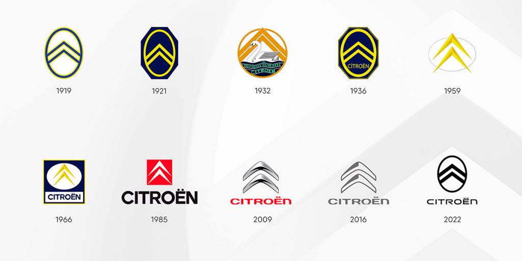
Along with Renault, Citroën is another of the brands that has changed its logo the most. Not so much in the symbol, which has always been those peculiar angled gears called chevrons, but in their design and color. Before making exclusively cars, Citroën manufactured gears, hence the logo.
They say that André Citroën, the founder of the company, was dazzled on a trip he made to Poland in 1900, where he saw some gears made of wood that the Poles used in the machinery of the mills. It was then that he decided to buy the patent, take it to France and start manufacturing those gears there, but in steel. The logo for his business was clear: two chevrons, one yellow and one blue, framed in an ellipse.
After World War I, when he stopped manufacturing weapons for the French army, André Citroën changed the course of the company and moved on to car manufacturing, but kept the original logo. The only variation in those years was the color. Until in 1930, when the firm incorporated a floating engine to reduce vibrations, and a white swan floating on the water was added to the logo.
But this image did not last long: barely two years later, the brand recovered its chevrons without further decorations and kept them practically intact, except for small modifications to update their design to the taste of each era, until 1985. It was then that the original blue and yellow were dispensed with and replaced by red and white.
Currently, the French company has once again changed its brand image to reinforce its line of electric cars. This time, it has recovered the logo from the 1920s, in which the two chevrons are framed by an oval, and has reinterpreted it, adapting it to current trends. This is the tenth update of its logo since the start of the company. The Citroën design team renewed the brand’s logo, with the collaboration of Stellantis Design Studio.
Seeing the rampant horse is enough to immediately identify the brand: a Ferrari. And it is funny, as this animal came to the firm by chance.
Enzo Ferrari, founder of the company, was a racing driver in the 1920s, before becoming a car manufacturer. In 1923, Ferrari, who was driving for Alfa Romeo, won the race held in Ravenna, at the Savio circuit, and was invited to a dinner at the home of Countess Paolina Biancoli. The young Enzo noticed a canvas that the countess had hung on one of the walls, with a rampant horse as the main figure.
That fabric was actually part of the fuselage of the plane that Francesco Baracca, son of the Countess and a national hero, had flown in World War I until he was shot down. Baracca, in turn, had obtained it by shooting down an enemy plane. The horse was the symbol of the hometown of that downed German pilot, Stuttgart, and the Italian did not hesitate to show it off on his plane from that moment on.
Seeing the interest of the young Italian driver in that fabric, the countess was quick to offer it to him so that he could showcase it in his car in the next races, assuring him that it would bring him good luck. However, Alfa Romeo did not authorize Enzo Ferrari to show off that horse in their cars until 1932, the year in which he won the Spa circuit. By then, Ferrari, tired of not being allowed to make his own decisions, broke with the company and decided to create his own team.
Il cavallino, which is what the Italians call this rampant horse, became part of his brand logo. To differentiate it from the one that appears on the Stuttgart shield (and that of its rival, Porsche), he added a yellow background, which is the color of the flag of his hometown, Modena.

Undoubtedly, Rolls-Royce is one of the best known and recognized brands in the world. Its name is a symbol of luxury, and many drivers believe that the British company makes the best cars in the world.
Founded by Charles Rolls and Henry Royce in 1904, the logo that its creators initially adopted were the two Rs of their last names in red and on a silver background. But in 1910, Charles Rolls, a fan of airplanes, died in a plane crash. As a sign of mourning, one of the two Rs became black, and remained so until 1933, the year in which the other founder, Henry Royce, died. Since then, both letters have been black.
But perhaps the most recognized symbol of this brand is not its logo, but that figure of a woman who defies the wind, known as the Spirit of Ecstasy. And it was born from a love story.
At that time, Rolls Royce cars featured an unsightly radiator cap, and one of the firm’s most distinguished customers, John Walter Edward Scott-Montagu, Lord Montagu of Beaulieu, commissioned a sculptor friend of his, Charles Robinson Skyes, to make a statuette that he could place on his Rolls, on top of that cap, to hide it.
Lord Montagu de Beaulieu was having an affair with his secretary, the Spanish-born actress Eleanor Velasco Thornton, which they kept very secret. It occurred to the artist to take that woman as a model. Skyes molded a woman with her clothes blowing in the wind, with one finger against her lips, as if asking for silence. In this way, it symbolized the secrecy of the relationship between the aristocrat and the actress.
The idea of hiding the Rolls-Royce radiator cap with some kind of figurine spread among the brand’s customers. But not everyone had the same good taste as Lord Montagu de Beaulieu, and the owners of the automobile company decided to stop this trend as, after all, it affected their image. So, encouraged by the aristocrat, they commissioned the same artist to create another figurine inspired by that of the actress. In this new creation, Skyes changed the features of the face and removed the gesture of asking for silence from the original. The Spirit of Ecstasy was born and has been on the firm’s cars ever since.
