5352 Views
Mobility
Motorways and dual carriageways: what are the differences between them, and between them and other types of roads?
Although we sometimes use both concepts interchangeably, a motorway is not the same as
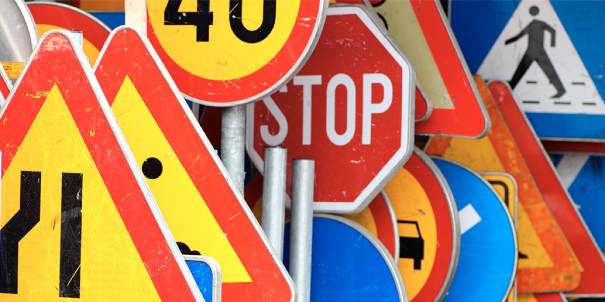
They are arrows, dolls and geometric forms, but they also have enormous power. Their mere presence tells us what to do, modifying our behavior at the wheel almost unconsciously. Traffic signs are a universal visual language. And yet one of their main virtues is maintaining their efficiency without calling too much attention.
If these signs had a Bible (or if they were atheists, a Constitution) it would be the 1968 Vienna Convention on Road Signs and Signals. It was signed by 69 countries, most of them European, along with others from Africa and Asia. The idea was to unify the world’s different signs so as to facilitate international transportation and trade and reinforce road safety. With these aims, the UN became the principal promoter.
The one in Vienna was the last of the 20th-century international summits to define the world’s most common system of signs. There have been later modifications to introduce new symbols, such as bicycles, and complementary European agreements.
This system of signs gives priority to symbols over written words. There is special attention to the geometric shape of the signs (a triangle or diamonds denote danger; rectangles include information…) and a series of guidelines is established, which each country can later adapt to its own signs. So, while the most common symbol to warn of wild animals is the deer, other countries have replaced it with moose or camels. Some regions have even made their local differences into tourist attractions by drawing kiwis (New Zealand), polar bears (in Svalbard, Norway) or monkeys (in Gibraltar).
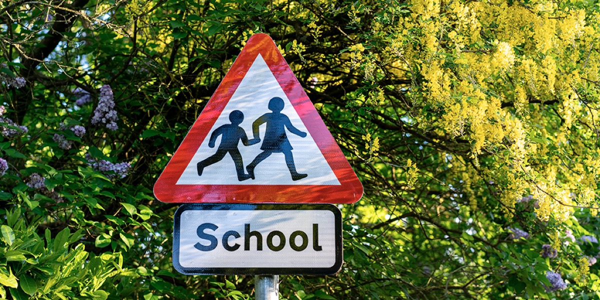
Apart from zoological differences, signs follow some common standards. The figure to warn of a nearby school is some running children (and these children, unlike the animals, are the same everywhere). But the drawing itself differs in each country: local designers can adapt the signs. This was the case with Margaret Calvert, who designed traffic signs in the United Kingdom, where her work gained international recognition, to the point that many consider her one of the mothers of contemporary signage. But not every country has a concrete graphic designer to thank, and in many cases it’s been a collective job, out of the spotlight.
Typography is another key element that should be unified, but that’s not the case, at least not internationally. In Spain, the typography used on motorways is called autopista, and the one employed on conventional roads, naturally enough, is carretera convencional. Other countries have opted for more classic styles, in Helvetica. Even so, these signs have reduced words to the minimum –limited to the names of towns, places and the ubiquitous STOP.
The US model, on the other hand, gives more importance to words. It is based on the Manual on Uniform Traffic Systems, which in 1935 standardized the different driving codes that several of the country’s automotive groups had used. This code has also incorporated a few European wrinkles and has spread throughout the United States and even reached some countries in the southern hemisphere, like Australia and New Zealand.
There are still differences between the world’s two principal codes, although the trend –in addition to maintaining local peculiarities– is that they converge in a single idiom. Perhaps the only one (outside of music and love) that’s really universal.